Table of Contents
Introduction
In today’s digital age, where smartphones and tablets dominate internet usage, understanding mobile web design is crucial for any business. With more consumers accessing websites through their mobile devices than ever before, ensuring that your site is optimized for mobile is not just an option but a necessity. This article explores the importance of mobile web design, the benefits of responsive design, strategies to boost conversion rates, and practical tips to enhance your mobile web presence.
Understanding Mobile Web Design

Mobile Web Design
What is Mobile Web Design?
Mobile web design refers to the process of creating websites that provide an optimal viewing experience on mobile devices. This involves designing for various screen sizes, ensuring fast loading times, and enabling easy navigation. The goal is to create a user-friendly interface that caters specifically to mobile users, taking into account their unique behaviors and needs.
Unlike traditional web design, which often prioritizes desktop users, mobile web design requires a different approach. It involves using techniques such as fluid grids, flexible images, and media queries to adapt the layout and content based on the device being used. This ensures that users have a seamless experience, regardless of whether they are using a smartphone, tablet, or desktop computer.
Why Mobile Web Design Matters
As of 2023, mobile devices account for over half of all global web traffic. This significant shift underscores the importance of mobile web design for businesses aiming to reach their target audience effectively. A well-designed mobile site not only enhances user experience but also plays a critical role in improving search engine rankings, as major search engines like Google prioritize mobile-friendly websites.
Moreover, a site that is not optimized for mobile can lead to high bounce rates, as frustrated users are likely to leave if they encounter difficulties navigating the site. Investing in mobile web design is vital not just for retaining users but also for maximizing conversions and driving sales.
Responsive Design: A Must-Have

Defining Responsive Design
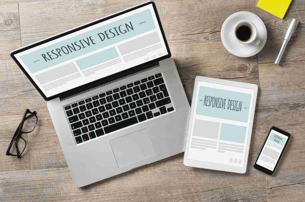
Responsive design is an approach that allows a website to adapt its layout and content to fit different screen sizes and orientations. This means that whether a visitor accesses the site from a smartphone, tablet, or desktop, they will have an equally pleasant experience. Responsive design employs CSS media queries to adjust styles based on the characteristics of the device being used.
This technique contrasts with the traditional method of creating separate mobile and desktop versions of a site, which can lead to inconsistencies and increased maintenance. By utilizing responsive design, businesses can streamline their web development process and provide a unified experience across all devices.
Benefits of Responsive Design for Users
One of the most significant benefits of responsive design is improved user experience. When a website automatically adjusts to fit the user’s screen, it reduces the need for zooming and scrolling, making it easier for users to navigate. This seamless experience leads to higher user satisfaction and encourages users to spend more time on the site.
Additionally, responsive design enhances accessibility. Users with different devices can access the same content without barriers, ensuring that everyone can navigate and interact with your site. This inclusivity not only broadens your audience but also reinforces your brand’s commitment to providing an excellent user experience for all.
Boosting Conversion Rates on Mobile Devices
Understanding Mobile User Behavior
Mobile users exhibit distinct behaviors compared to desktop users. They tend to seek quick, efficient interactions and often make decisions on the go. Studies have shown that mobile users value speed and convenience, with many expecting pages to load within a few seconds. If your site fails to meet these expectations, you risk losing potential customers.
Furthermore, mobile users are more likely to engage in local searches, with many seeking immediate answers or solutions. This shift in behavior emphasizes the need for businesses to optimize their mobile web design not just for aesthetics but for functionality and speed to cater to the needs of mobile users effectively.
Strategies to Enhance Mobile Conversion
To boost conversion rates on mobile devices, businesses should focus on simplifying the user journey. This can be achieved by minimizing the number of clicks required to complete a purchase or inquiry. Implementing clear calls-to-action (CTAs) that are easy to find and use can guide users through the conversion process smoothly.
Additionally, optimizing forms for mobile use is crucial. Long, complicated forms can deter users from completing their purchases. Instead, consider using auto-fill options, reducing the number of required fields, and ensuring that buttons are large enough for easy tapping. These strategies can significantly enhance the likelihood of converting mobile visitors into paying customers.
Practical Tips for Effective Mobile Web Design
Simplifying Navigation for Mobile Users
Navigation is a critical aspect of mobile web design. A cluttered menu or complex navigation structure can confuse users and lead to frustration. To simplify navigation, utilize collapsible or hamburger menus that save screen space while still providing access to all necessary links.
It’s also important to ensure that important information is easily accessible. Place key elements, such as contact information and product categories, at the top of the page or in a fixed position to make them readily available. User-friendly navigation can significantly enhance the overall user experience on mobile devices.
Optimizing Images and Content for Speed
Page speed is a crucial factor for mobile web design. Large images can slow down page loading times, which can lead to increased bounce rates. To optimize images, use properly compressed formats and consider using responsive images that adjust based on the device’s resolution. This ensures that users receive the best quality images without compromising site speed.
Additionally, streamlining content by eliminating unnecessary text and focusing on concise, relevant information can improve loading times and enhance user engagement. A clean, fast-loading website is more likely to retain users and encourage them to explore your offerings.
User-friendly navigation can significantly enhance the overall user experience on mobile devices. Page speed is a crucial factor for mobile web design. Large images can slow down page loading times, which can lead to increased bounce rates. To optimize images, use properly compressed formats and consider using responsive images that adjust based on the device’s resolution. This ensures that users receive the best quality images without compromising site speed. Additionally, streamlining content by eliminating unnecessary text and focusing on concise, relevant information can improve loading times and enhance user engagement.
A clean, fast-loading website is more likely to retain users and encourage them to explore your offerings. A well-designed mobile website can improve user engagement and retention rates. Incorporating responsive images is essential for optimizing loading times across various devices. Streamlining content and eliminating unnecessary text can enhance user experience on mobile platforms. Effective navigation plays a crucial role in ensuring users can easily access desired information. Prioritizing page speed and image optimization are key factors in mobile web design.
Conclusion: Invest in Mobile Web Design Today
Recap of Key Points
In conclusion, the importance of mobile web design cannot be overstated. With the majority of internet traffic coming from mobile devices, businesses must prioritize creating an optimized mobile experience. Responsive design is essential for ensuring that users have a pleasant experience, regardless of device used. Additionally, understanding mobile user behavior and implementing effective strategies can significantly enhance conversion rates on mobile platforms.
Encouragement to Take Action
As we have explored, investing in mobile web design is not merely a trend but a necessary step for businesses looking to thrive in the digital landscape. By ensuring your website is optimized for mobile users, you can improve user experience, boost conversions, and ultimately grow your business. Don’t wait – take action now to elevate your mobile web presence and cater to the ever-growing mobile audience.
FAQs
1. What is the difference between mobile web design and responsive design?
Mobile web design typically refers to creating separate mobile versions of a website, while responsive design adapts the layout and content based on the device’s screen size, providing a consistent experience across all devices.
2. Why is mobile web design important for my business?
Mobile web design is crucial because a significant portion of internet users access websites via mobile devices. An optimized mobile experience can improve user satisfaction, reduce bounce rates, and increase conversion rates.
3. How can I improve my website’s mobile speed?
You can improve your website’s mobile speed by optimizing images, minimizing the use of heavy scripts, reducing the number of redirects, and ensuring your site is hosted on a reliable server.
4. What are some best practices for mobile navigation?
Best practices for mobile navigation include using a hamburger menu for space-saving, ensuring key information is easily accessible, and minimizing the number of clicks required to reach important content.
5. How do I know if my website is mobile-friendly?
You can check if your website is mobile-friendly using Google’s Mobile-Friendly Test tool, which analyzes your site’s performance on mobile devices and provides suggestions for improvement.